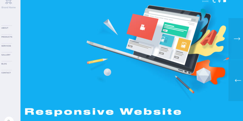
Google’s been pushing responsive website design for sometime now for a simple reason that it serves the users well across devices. As per Google, smartphones are responsible for a whopping 70% of the total internet traffic it receives.
With new and compact devices earning user favour, no wonder website responsiveness is looked forward to when it comes to its overall performance. It has become quite a trend among web developers to include website responsiveness as a distinct feature when programming website structures.
Pretty reasonable, as responsive web design or RWD, as coined back in 2010, has become quite a standard practice 8 years later. And why not? As much as 56.74% of the world’s internet usage is generated from tablet and mobile phone usage. Here’s a close look at what it encompasses.Â
What is a Responsive Website?
Website responsiveness contains the flexibility and adaptability of website layout and content with varying device screen sizes. In simple terms, it is the re-adjustability of the visible website screen as per device variety and change in screen size. The following three components are specific to responsive website designing and development.
-
Fluid grids
Website responsiveness is closely related to providing enhanced user experience. Use of fluid grids does exactly that through automatic rearrangement of columns to resize a website and fit it in the user’s screen. It does this through CSS and ensures readjustment irrespective of whether the screen size is 5.5’,5.9’,9.7’,13’,24’ or even a larger screen size.Â
The automatic screen resizing through a fluid layout ensures website consistency across devices.
-
Media queries
Each device class users may use has distinct physical characteristics. When we open a website in, say a smartphone, it may differ in its look and feel than when opened in a tablet, due to the varying physical properties if the site is not responsive.
Media queries eliminate this difference by allowing the website to first fetch such properties from each device class when opened. It thus makes distinction of one device class possible from another at the onset and alter’s the design of the website accordingly. The queries are better customized than HTML or CSS breakpoints, thus providing an improved tailored experience to users.
-
Flexible visuals
Inclusion of flexible visuals in responsive website designing and development allows readjustment of the dimension element of rich media files. Such readjustment occurs on the container and its viewpoint levels when we open the site. As the viewpoints can differ from one device to another even under the same class, making timeless designs is possible today through flexible visuals under responsive website designing.
The responsive design of a website is important because it -Â
- Adds to the overall experience of users
- Helps gain traffic from increasing mobile users
- Helps build positive brand perception
- Improves the overall page loading speed
- Brings a positive impact on the SERP rankings
- Saves time and cost involved in customizing website for each device class
Types of Responsive Design
Based on their characteristic differences website responsiveness is classified under 3 primary types.
-
Fluid layout
Under fluid layout, we use relative units to express fluid width in percentage (%). We can identify it on screens that are stretchable, supporting right or left alignments in all directions, element placement from lateral to vertical, and the likes.Â
Designing this layout can involve a lot of time due to the need to perform standalone tests for each website block to check responsiveness.Â
-
Responsive layout
Responsive layouts use CSS media queries to achieve breakpoints that define screen size adaptiveness as per device particulars. It uses pixels for fixed width expression of each adaptive screen size and coding is done at the webpage’s block level.
-
Fluid-responsive layout
A fluid-responsive layout combines the efficiencies of previous two responsive designs to bring about the results. It implements the use of Media Query Rules under CSS and is a proven and popular layout usage for website responsiveness designing.

Good Examples of Responsive Websites (Shopify, Github, Slack, and Dropbox)
Some most popular examples of responsive websites in today’s world include the following.
- Shopify: An outstanding example of user experience consistency, Shopify only rearranges website illustrations and call-to-action, needing a user to only scroll for the characters to appear. Shopify’s page speed is impressive too at under 5 seconds.
- GitHub: Device consistency is one of the top visual delights under GitHub’s website responsiveness. Standout observations are column usage in above-the-fold area, use of sign-up form reduced to button, search bar usage, and menu hiding for clutter removal and clarity.
- Slack: Slack’s simplistically designed website stands out in responsiveness too. It has an excellent viewport adaptability and is easy to use, distinctly placing the call-to-action button across the column to avoid confusion of clicking.
- Dropbox: Dropbox is a fine illustration of sleek responsive designing through fluid grid usage. You can observe change in image orientation and font colours for background colour accommodation to adapt to and from smartphone and laptop screens. Other details include usage/deletion of the scrolling arrow and visibility of the sign-up form.
When designing a responsive website, take care to include four key areas, namely viewport adjustments, breakpoint creation, relative size definition and media query set-up. Creating a site with the aim to set multiple versions of the same content sure keeps it timeless and more accommodating in the long run.


Comments