Interaction Design (IxD) is a field of design where a designer creates interactive user interfaces taking into account how people will engage with the same.
A user interface with a good interaction design makes a user’s journey smoother and more satisfying. IxD principles consider users’ wants, limits, and circumstances to engage users physically and emotionally.
Gillian Crampton Smith, an interaction design scholar, first came up with IxD dimensions in the 2000s that help designers create interactions that look and feel natural to viewers.
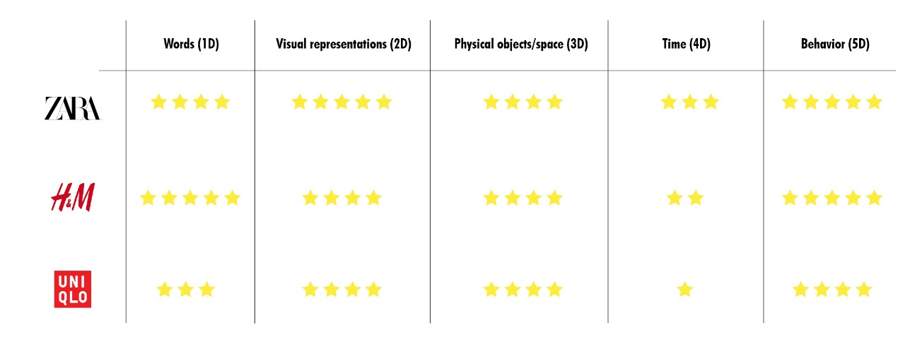
There are five principles of IxD where 1D is the words, 2D shows visual representation, 3D shows the physical product or service, 4D refers to animations, videos & sounds, and 5D relates to the product’s behaviour on user’s input.
Zara vs H&M vs Uniqlo: What’s the difference?
Zara
Landing page interaction
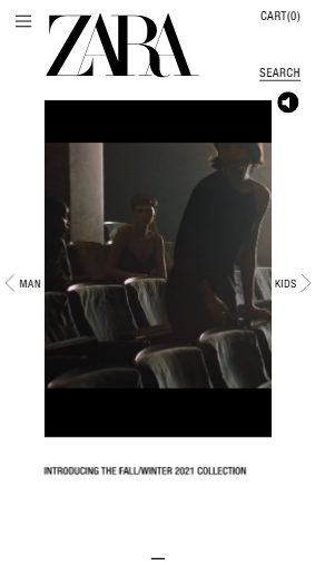
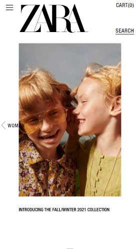
The landing page starts with a carousel showcasing the new fall/winter collection promotional video. By interacting with the carousel, the users can switch to different categories. The navigation icon on the top-left corner can be used for navigating to different categories and products.
Product-discovery page interactions
Users can quickly scroll to different sub-categories of the products using the top menu. Using the scroller below the sub-category, the user can expand or contract the product list by viewing either single or multiple products as per their convenience. This helps in saving time and enables a more personalized experience.
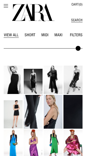
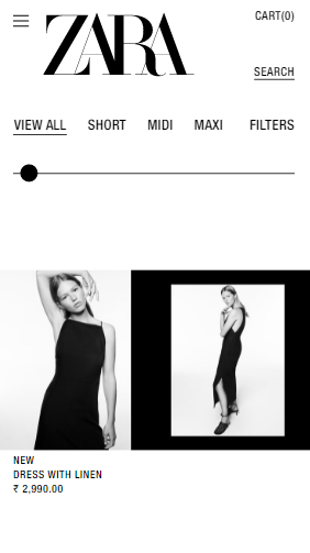
The product-discovery page is full of static creatives as well as videos that showcase the product’s aspect.
[videopress e88qPRhA]
Add to cart experience
The design approach of the product-listing page is very minimalistic and smooth. It showcases only the picture, price, product name, and CTA button for adding to the cart.
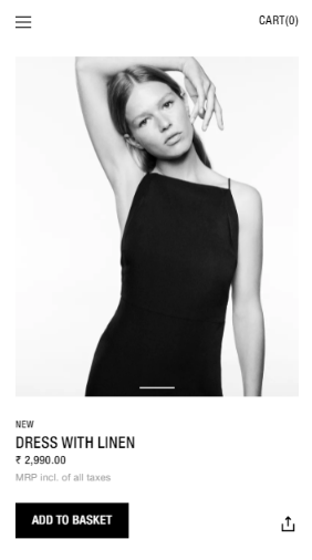
To view more product information, viewers can swipe up, while to move to a different product, viewers can swipe left or right. The ‘add to chart’ action also happen on the same page in a pop-up.
[videopress t5vwc1PO]
It is a very intuitive approach that Zara has taken for viewers to move around on their website. The monochromatic colour scheme and negative space give a premium & sophisticated feel, synonymous with Zara as a website.
H&M
Landing page interactionÂ
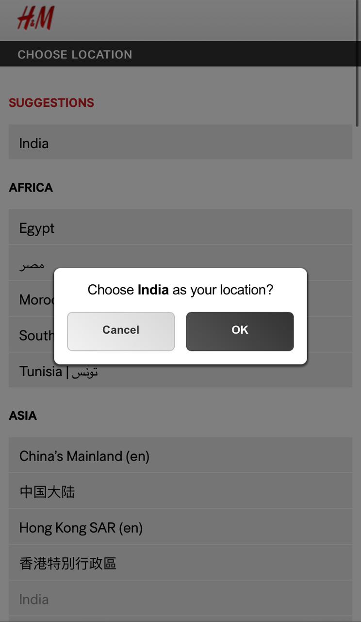
As H&M is a global brand, the landing page provides users with the option to choose their preferred language and country.
The website captures the users’ attention on the home page by showcasing the ongoing sales & offers first. This incentivizes users to explore further options followed by the Instagram-like ‘Story’ tab to navigate trending product categories.
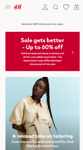
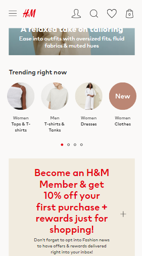
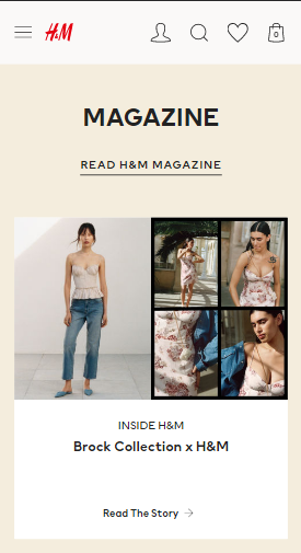
As you scroll down to the home page, there is a magazine section as a catalogue for product collections in different categories.
Product-discovery page interactions
The product-discovery page starts with trending offers. To filter and sort different products, there is a sticky menu which comes quite handy.
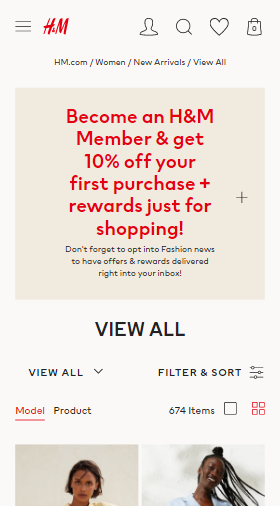
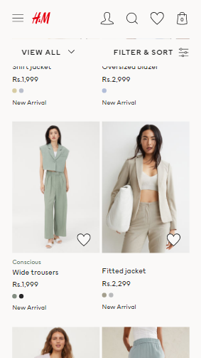
The product-listing page showcases the picture, name, price and colour of the product available. One can shortlist their favourite items by clicking on the like button provided for every product. This makes the website experience very interactive & personalized for the viewers.
Add to cart experienceÂ
The product page starts with a nice full view of the product. Add to chart, select size and price options are static on the page. There is an elaborative product description as the users scroll down, and just above that colour selection option is available. By scrolling further down, different product views expand to a full screen by clicking on them, whether pictures, details, delivery & payment or product background.
[videopress Wxoyt18n]
As H&M is a fast-moving fashion brand, its overall website is more descriptive in its products and leads consumer buying by promoting several offers.
Uniqlo
Landing page interaction
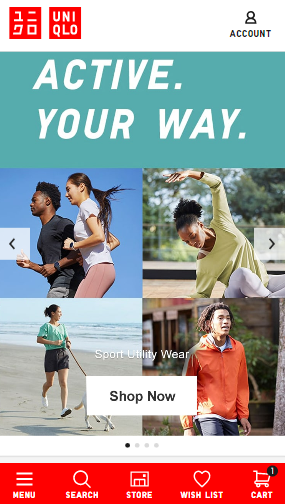
Uniqlo mobile website doesn’t really look like an e-commerce website at first; it seems more like an e-magazine. As you scroll through the website, you discover different product categories showcased by rich & interactive media like carousels and slideshows. It showcases a different aspect of the brand, like artist collaboration and commitment to sustainable development. There is a sticky menu at the bottom for users to move around, which is quite intuitive for any new user.
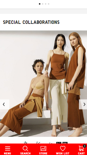
Product-discovery page interactions
The product discovery page design and navigation is quite sober, though the option for filtering products and changing view seem helpful. This page showcases product reviews and the option to like the product, making the experience more interactive for viewers.
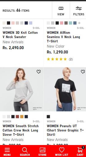
Add to cart experience
Add to cart experience is again quite simplistic, which seems like an intentional move on the brand’s part. The product is highlight through several static creative.
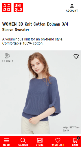
Add to cart page also allows viewers to check availability in local stores, which again seems intentional on the brand’s part to promote their retail stores.
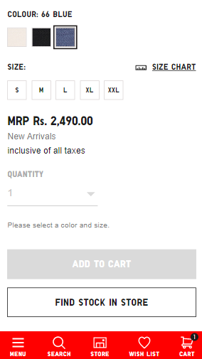
Overall, the tone of the website is simplistic yet informative.
Martech Scroll Rating for interactivity


Comments